
Grids in SwiftUI
Grids in SwiftUI
Introduction
The grid layout has become a familiar paradigm for mobile user experiences. The canonical example of grid layout is in the built-in camera roll app for iOS. It can also be found on an extremely popular social photo-sharing app in the feature called (unsurprisingly) the grid. It is an intuitive, efficient means for presenting large collections of views to the user.

Figure 0
Luckily, SwiftUI gives us a native structure for creating impressive grid layouts with only a few lines of expressive code. TheGridstructure is highly performant and provides helpful functionality so that your scrollable grid layout can adapt to various device sizes and orientations. Without further ado, let’s experience the power of grids by building some in SwiftUI!
Create the project
To explore the power and flexibility of theGridstructure, we’ll create an app that presents a calendar view. Let’s start by creating a new project inXcodecalled “GridCalendar”. We won’t need to use Core Data or include tests.
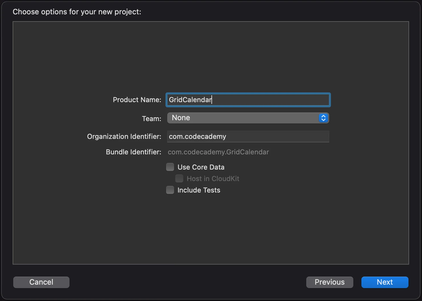
Figure 1
We should now be at the starting point of a standard SwiftUI project with the `ContentView.swift’ file open:
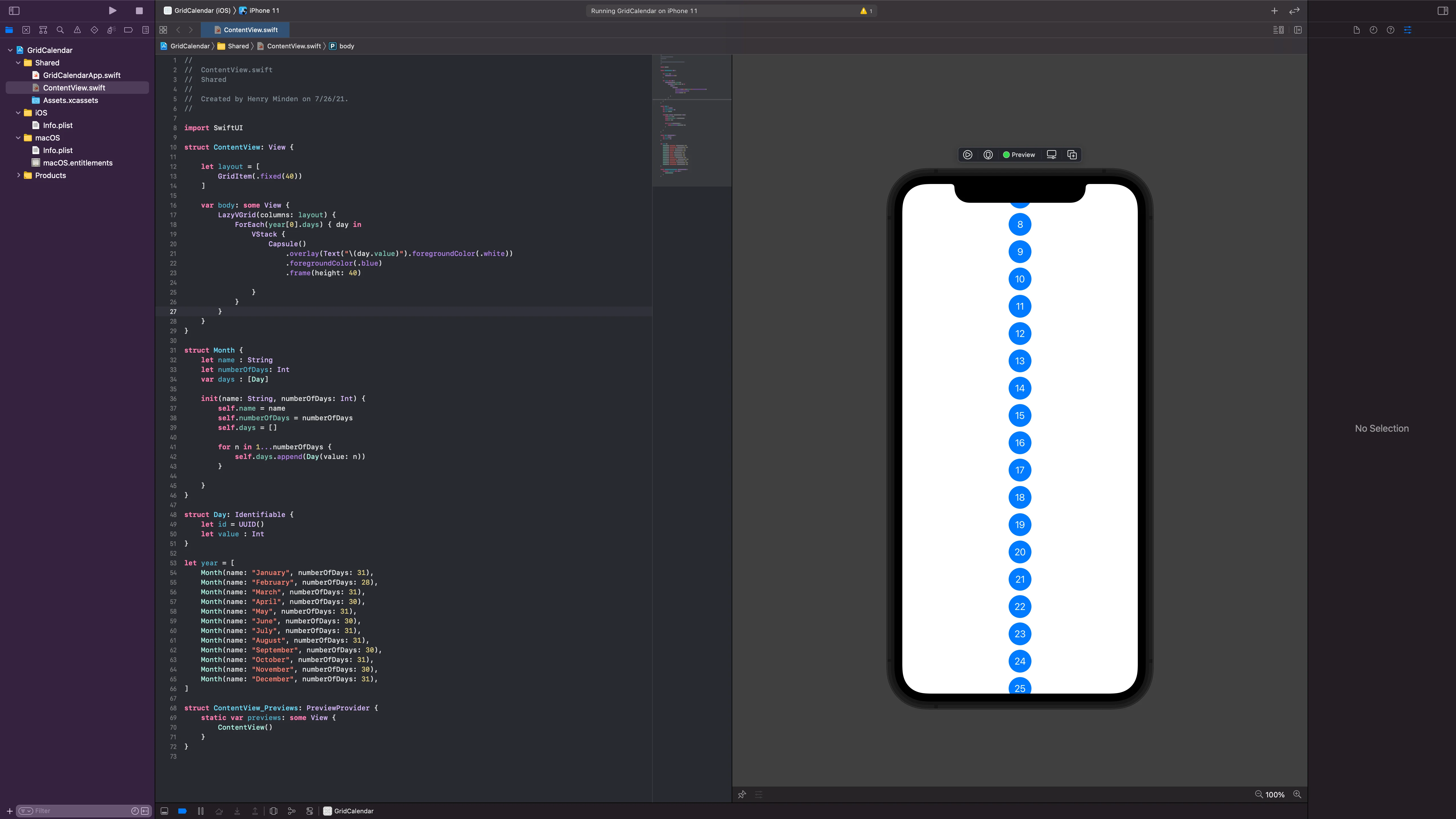
Figure 3
Who is lazy?
You might be curious why the grid view is namedLazyVGrid. Similar to the concept oflazy properties, theLazyinLazyVGridandLazyHGridrefers to the fact that the elements of the grid aren’t created until they are needed to display in the view. This is a smart strategy because in practice we might want to create grids with a large count of complex items. Loading thousands of images would cause the app to slow down. By using lazy loading, we create much smoother, more performant user experiences.
Make the grid scroll
As we expected, we have a vertical grid layout with one column of fixed width! However, there is one slight issue: we can’t see all of the content items of the grid. It would be great if there was a way to scroll the view. Luckily with SwiftUI, all we need to do is wrap ourLazyVGridwith aScrollView. Modify yourbodyvariable so it looks like this:
var body: some View {        ScrollView {            LazyVGrid(columns: layout) {                ForEach(year[0].days) { day in                    Capsule()                        .overlay(Text("\(day.value)").foregroundColor(.white))                        .foregroundColor(.blue)                        .frame(height: 40)                }            }        }    }
Copy to clipboard
var body: some View { ScrollView { LazyVGrid(columns: layout) { ForEach(year[0].days) { day in Capsule() .overlay(Text("\(day.value)").foregroundColor(.white)) .foregroundColor(.blue) .frame(height: 40) } } } }If you’re using the live preview, you might have to click the play button to make the view respond to user interaction.
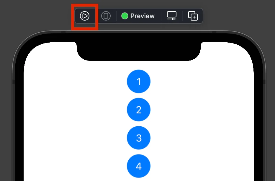
Figure 4
Aha! The view is free to scroll about the window 🕊
Exploring layout withGridItem
But you may be thinking, this isn’t really a grid, it’s more of a list. Let’s explore the power ofGridItemto create incredible, adaptable grid layouts! Change the layout constant so that we have four instances ofGridItemlike so:
let layout = [        GridItem(.fixed(40)),        GridItem(.fixed(40)),        GridItem(.fixed(40)),        GridItem(.fixed(40))    ]
Copy to clipboard
let layout = [ GridItem(.fixed(40)), GridItem(.fixed(40)), GridItem(.fixed(40)), GridItem(.fixed(40)) ]As you might expect, this gives us four columns of fixed width:
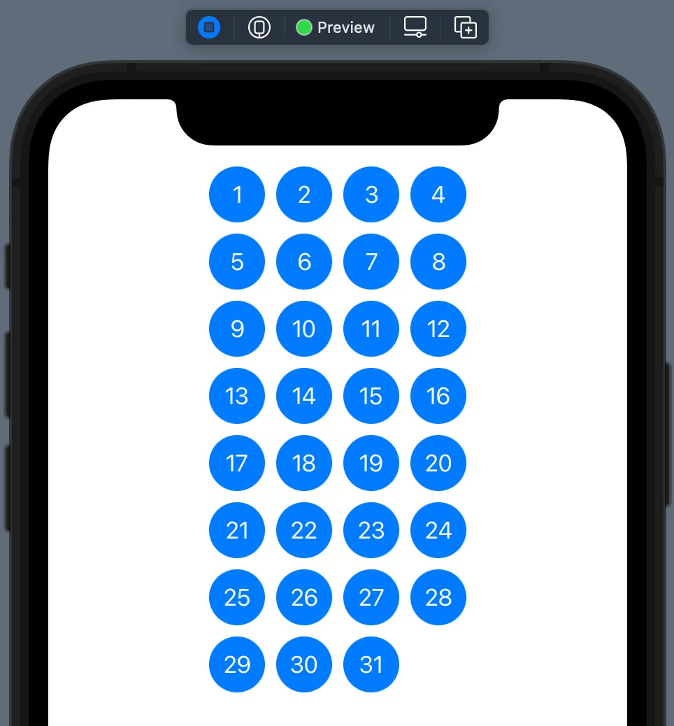
Figure 5
Now let’s change the lastGridItemto use theflexibleoption:
let layout = [        GridItem(.fixed(40)),        GridItem(.fixed(40)),        GridItem(.fixed(40)),        GridItem(.flexible(minimum:40))    ]
Copy to clipboard
let layout = [ GridItem(.fixed(40)), GridItem(.fixed(40)), GridItem(.fixed(40)), GridItem(.flexible(minimum:40)) ]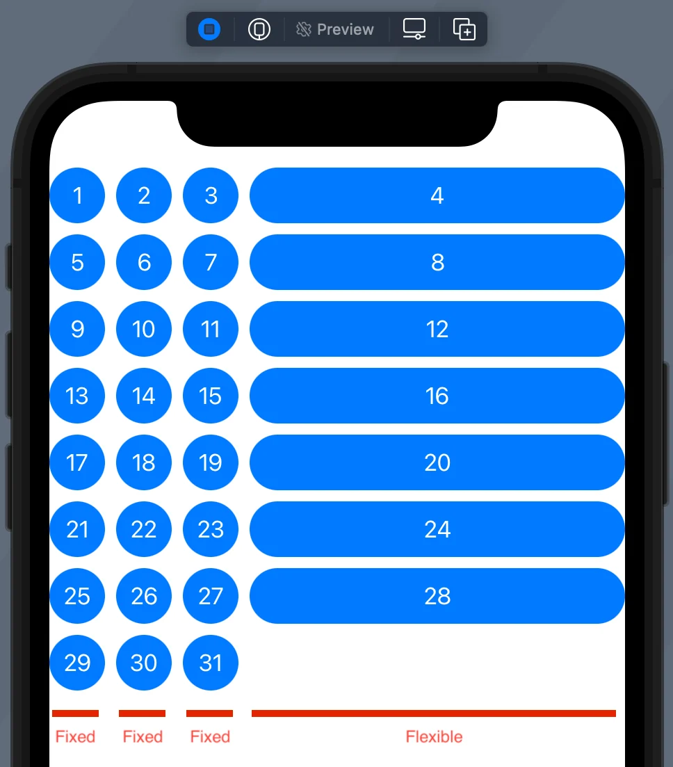
Figure 6
The flexible option creates a column that takes up the available width it has. You must define a minimum width, and you can optionally specify a maximum width. Finally, there is also anadaptiveoption that fits multiple columns inside the width of a singleGridItem. This can be super helpful when designing layouts that adapt to phones and tablets of varying sizes and orientations. Modify thelayoutconstant so it looks like this:
let layout = [        GridItem(.fixed(40)),        GridItem(.fixed(40)),        GridItem(.fixed(40)),        GridItem(.adaptive(minimum: 80))    ]
Copy to clipboard
let layout = [ GridItem(.fixed(40)), GridItem(.fixed(40)), GridItem(.fixed(40)), GridItem(.adaptive(minimum: 80)) ]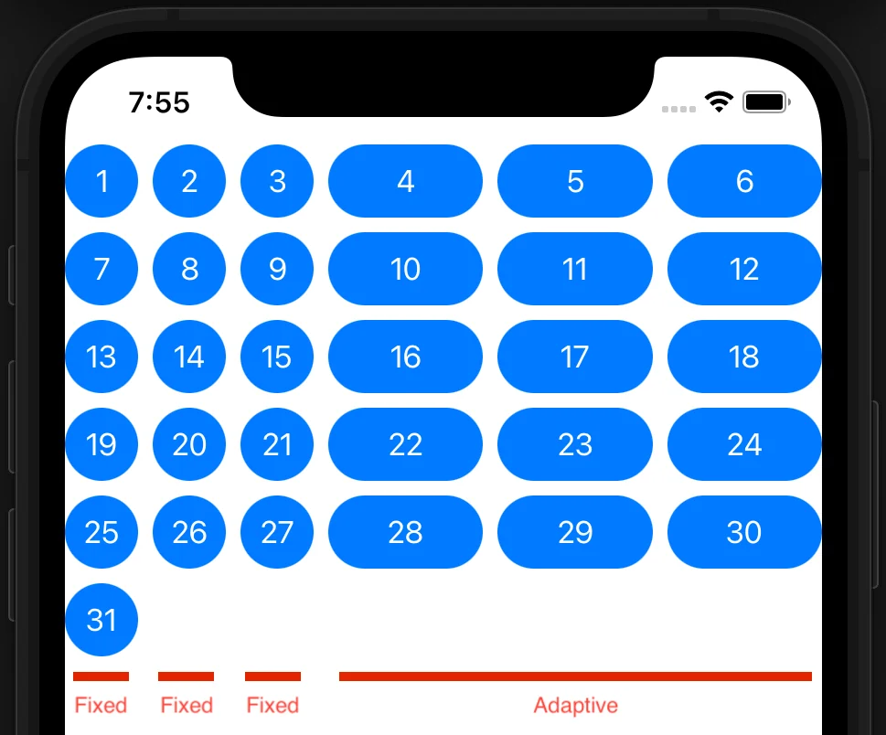
Figure 7
The adaptiveGridItemfills up the remaining width with three columns of at least width 80 in this case. But if we rotate the device to landscape orientation we can see the layout dynamically adapts:
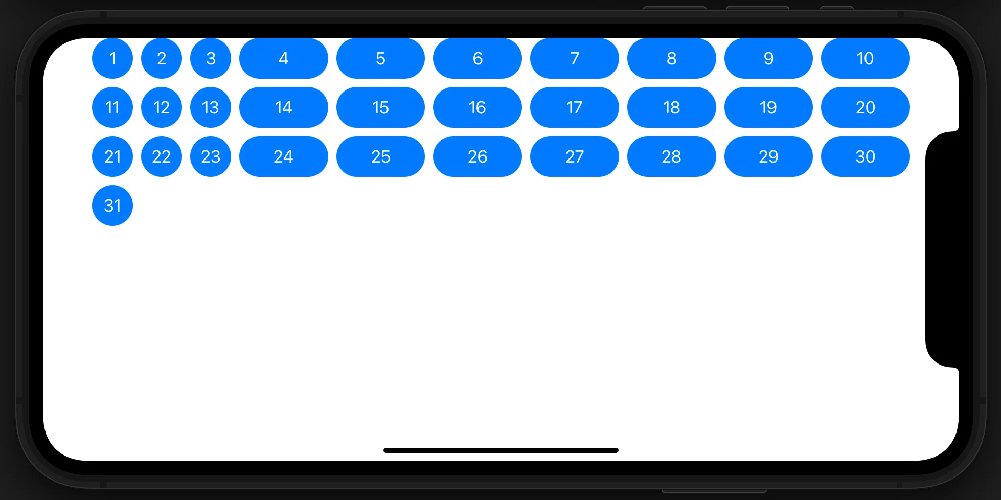
Figure 8
Since we’re building a calendar view, let’s use seven flexible grid items like so:
let layout = [        GridItem(.flexible(minimum: 40)),        GridItem(.flexible(minimum: 40)),        GridItem(.flexible(minimum: 40)),        GridItem(.flexible(minimum: 40)),        GridItem(.flexible(minimum: 40)),        GridItem(.flexible(minimum: 40)),        GridItem(.flexible(minimum: 40))    ]
Copy to clipboard
let layout = [ GridItem(.flexible(minimum: 40)), GridItem(.flexible(minimum: 40)), GridItem(.flexible(minimum: 40)), GridItem(.flexible(minimum: 40)), GridItem(.flexible(minimum: 40)), GridItem(.flexible(minimum: 40)), GridItem(.flexible(minimum: 40)) ]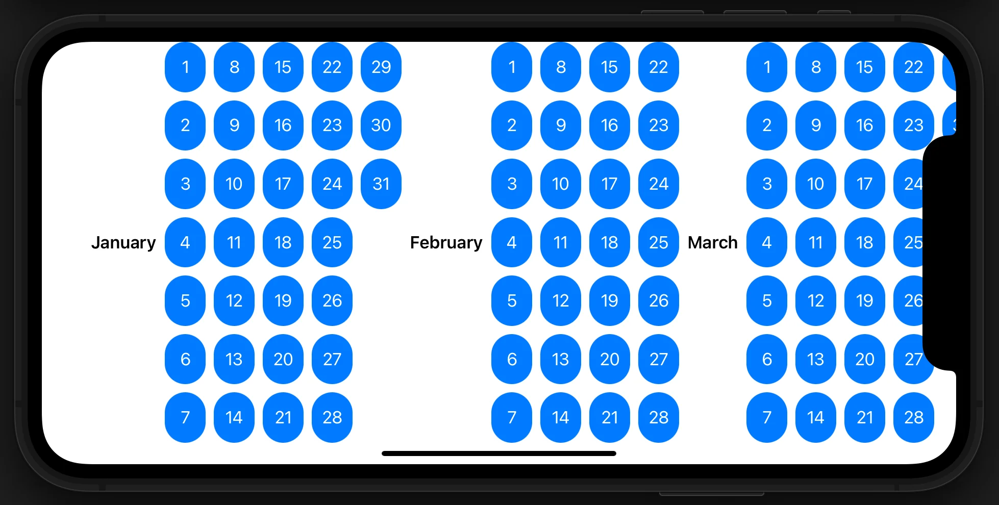
Figure 9
Adding sections to the grid
So far we have been looking at the first month of the year, but in our calendar we’d like to view all of the months at the same time. We can use theSectionstructure to separate each month into a section with its own title. Modify yourbodyto look like this:
var body: some View {        ScrollView {            LazyVGrid(columns: layout) {                ForEach(year, id: \.name){ month in                    Section(header: Text(verbatim: month.name).font(.headline)) {                        ForEach(month.days) { day in                            Capsule()                                .overlay(Text("\(day.value)").foregroundColor(.white))                                .foregroundColor(.blue)                                .frame(height: 40)                        }                    }                }            }        }    }
Copy to clipboard
var body: some View { ScrollView { LazyVGrid(columns: layout) { ForEach(year, id: \.name){ month in Section(header: Text(verbatim: month.name).font(.headline)) { ForEach(month.days) { day in Capsule() .overlay(Text("\(day.value)").foregroundColor(.white)) .foregroundColor(.blue) .frame(height: 40) } } } } } }We wrapped theForEachwe had with aSectionview that gives us a header view that we can use to display the name of the month. Then we wrapped theSectionwith anotherForEachthat iterates through all of the months of the year. Remember that we didn’t make theMonthstructure conform toIdentifiable, so we need to specify a unique key path in theForEachstructure. As long as we don’t have the same name of the month in our year, we can use it as the unique id.
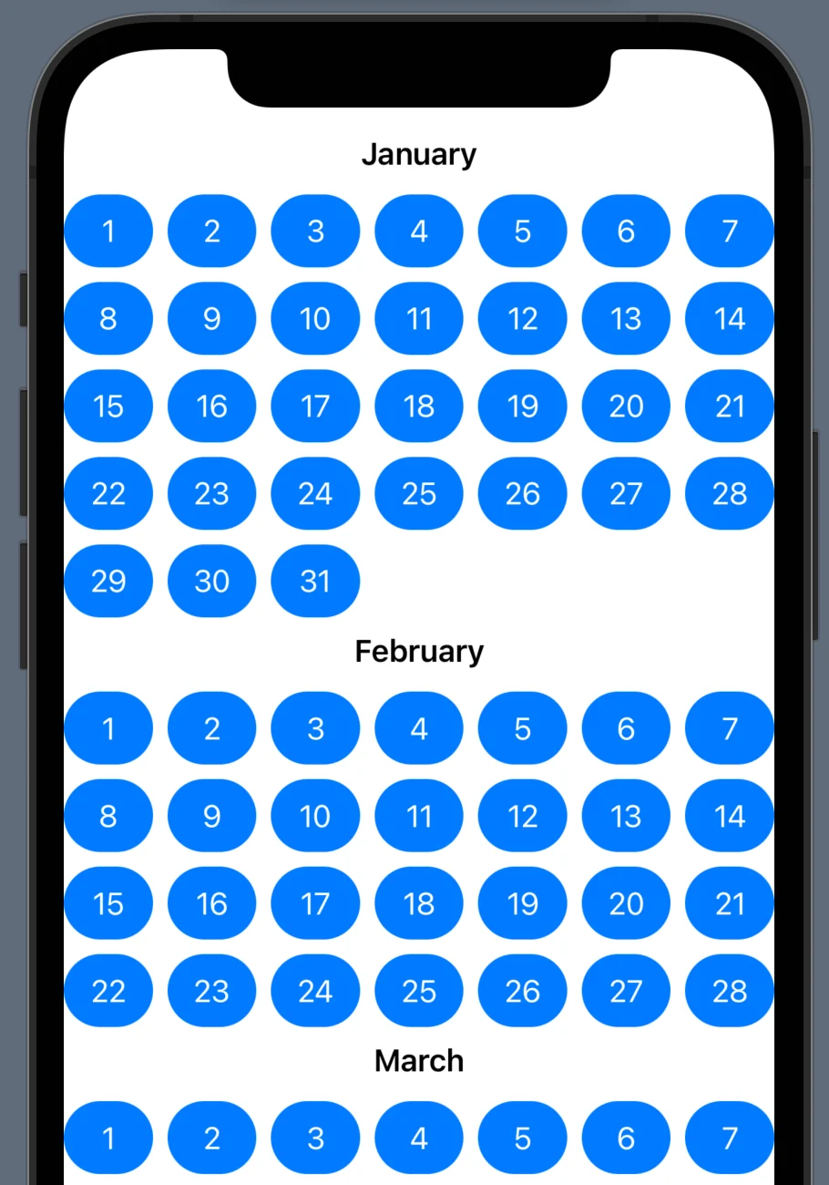
Figure 10
Another useful feature of grids is the ability to pin views while scrolling. Modify the definition of yourLazyVGridlike so:
LazyVGrid(columns: layout, pinnedViews: [.sectionHeaders]) {
Copy to clipboard
LazyVGrid(columns: layout, pinnedViews: [.sectionHeaders]) {Now you can see the section header view sticks to the top of the screen while you are scrolling through that particular section. This can help create a smooth, intuitive user experience.
Horizontal grid views
There may be situations where you want the grid to be laid out in horizontal rows instead of vertical columns. Changing this configuration is trivial with SwiftUI! Modify yourbodyvariable so it looks like this:
var body: some View {        ScrollView(.horizontal) {            LazyHGrid(rows: layout, pinnedViews: [.sectionHeaders]) {                ForEach(year, id: \.name){ month in                    Section(header: Text(verbatim: month.name).font(.headline)) {                        ForEach(month.days) { day in                            Capsule()                                .overlay(Text("\(day.value)").foregroundColor(.white))                                .foregroundColor(.blue)                                .frame(width: 40)                        }                    }                }            }        }    }
Copy to clipboard
var body: some View { ScrollView(.horizontal) { LazyHGrid(rows: layout, pinnedViews: [.sectionHeaders]) { ForEach(year, id: \.name){ month in Section(header: Text(verbatim: month.name).font(.headline)) { ForEach(month.days) { day in Capsule() .overlay(Text("\(day.value)").foregroundColor(.white)) .foregroundColor(.blue) .frame(width: 40) } } } } } }We made four modifications:
- We changed theScrollViewto the horizontal option
- We changedLazyVGridtoLazyHGrid
- We changedcolumns:torows:
- We changed the.frameof theCapsuleto specify width instead of height
And voila, our grid is now laid out horizontally with seven flexible height rows:
Figure 11
In the case of our calendar, it definitely makes more sense to display it in a vertical grid. Let’s change it back to vertical:
var body: some View {        ScrollView {            LazyVGrid(columns: layout, pinnedViews: [.sectionHeaders]) {                ForEach(year, id: \.name){ month in                    Section(header: Text(verbatim: month.name).font(.headline)) {                        ForEach(month.days) { day in                            Capsule()                                .overlay(Text("\(day.value)").foregroundColor(.white))                                .foregroundColor(.blue)                                .frame(height: 40)                        }                    }                }            }        }    }
Copy to clipboard
var body: some View { ScrollView { LazyVGrid(columns: layout, pinnedViews: [.sectionHeaders]) { ForEach(year, id: \.name){ month in Section(header: Text(verbatim: month.name).font(.headline)) { ForEach(month.days) { day in Capsule() .overlay(Text("\(day.value)").foregroundColor(.white)) .foregroundColor(.blue) .frame(height: 40) } } } } } }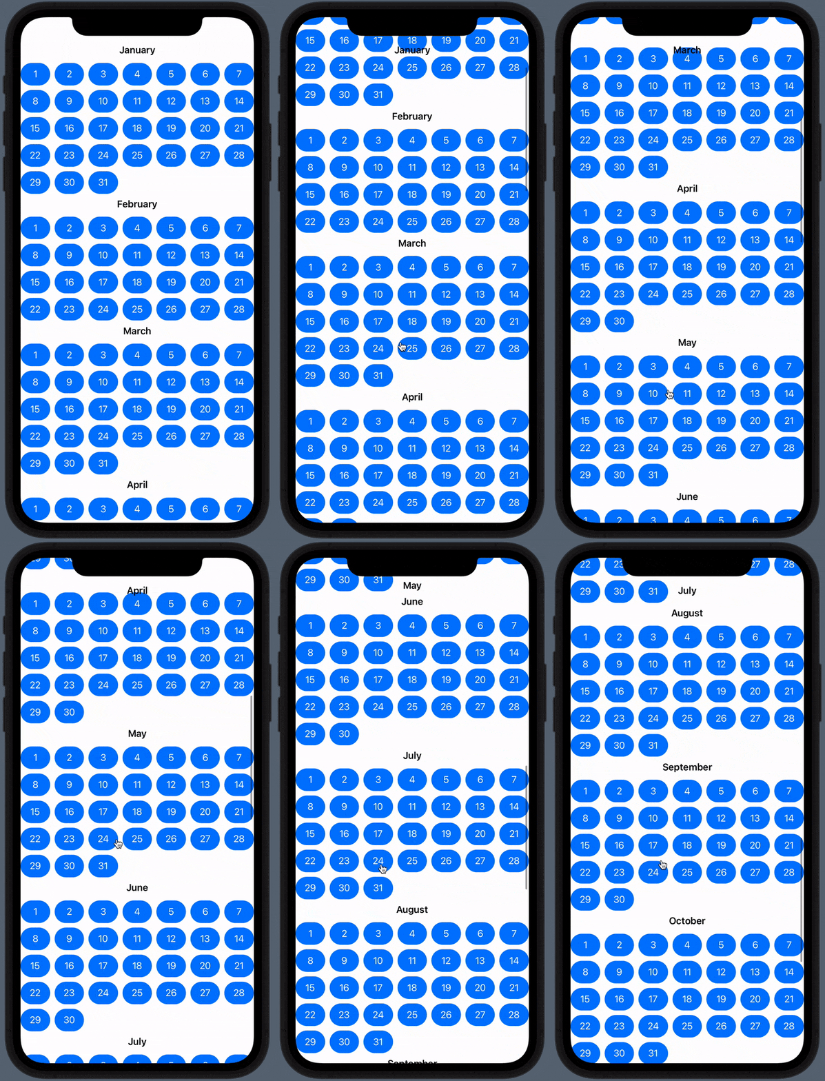
Figure 12
Conclusion
In this article, we explored the power and flexibility of theLazyVGridandLazyHGridstructures by building a simple calendar app. We saw how to useGridItemto generate highly customizable grid layouts. We learned how to make the grid scrollable and how to add pinnable sections to the view. You can download the complete code for the application at the linkhere.
As a challenge exercise, you might try to add functionality to the calendar to make it more realistic, such as labels for the days of the week (Sunday – Monday) and making the dates line up accurately with the labels given a specific year.
'The Codecademy Team, composed of experienced educators and tech experts, is dedicated to making tech skills accessible to all. We empower learners worldwide with expert-reviewed content that develops and enhances the technical skills needed to advance and succeed in their careers.'
Complete Payment to Unlock Full Guide & Source Code
You are viewing the 30% preview. Join TopCourseAI Pro to unlock the remaining 70% of this article, unblur all code snippets, and gain full access to all 412 technical projects and guides.
Ready to access the complete step-by-step tutorial?
Gain full unhindered access to all 412 technical projects and guides, unblur all source code snippets, and download runnable scripts.
Google VaultGemma: A Guide to Privacy-First LLMs
Next BlueprintHTML Class vs ID: What’s the Difference and When to Use Each
Related Project Guides
View all 412 →Best IDEs for Mobile App Development: A Complete Guide
AnIDE(Integrated Development Environment) combines essential development tools into a single application, making mobile app development more efficient and organized. Rather than juggling separate tools for coding, debugg...
Mobile developmentBuilding Lists in SwiftUI
Presenting textual and graphical information in a column is a very familiar and natural way to visually organize data. Almost all modern apps utilize some sort of columnar data display. Think of popular social media apps...
Mobile developmentHow to Create SwiftUI Forms with Pickers: A Step-by-Step Guide
InSwiftUI, aFormis a specialized container view used to create user-friendly input interfaces, typically for data entry tasks like filling out settings, profile details, or preferences. It’s optimized for grouping contro...
Ready to start building your next project?
Enjoyed this guide? Continue exploring our library of 412+ step-by-step guides, starter files, and practical projects across Web Development, Mobile Apps, AI, and Design.