
Tab Views and Labels
Tab Views and Labels
Introduction
This article will teach you:
- What a Tab View is
- Why more complex applications benefit from Tab Views
- How to Create a Tab View
- What a Tab Item is
- What a Label is
- How to Create Tab Views Using Labels and TabItems
- How to Create a Tab View with the Page Style
Let’s begin by creating a project that will showcase the capabilities of Tab Views and Labels. Your final project will resemble the following video.
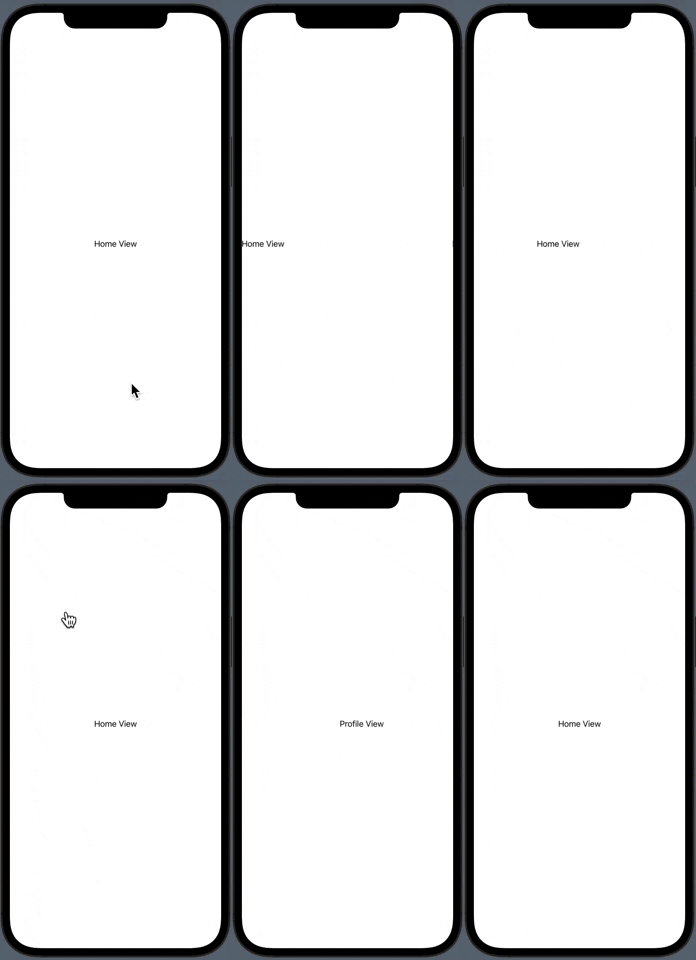
Final Project Video
Creating the project
To begin, open upXcode. You should get a window that resembles the image below.
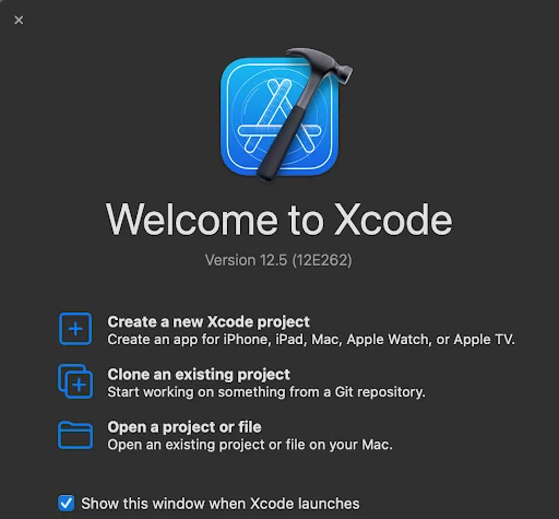
XCode Window
In the center of the Xcode window, you will seeCreate a new Xcode project. Go ahead and click on this.
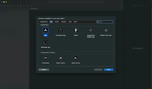
Project Selection
Next, you should see project templates.Appshould already be selected; if not, go ahead and click that. At the bottom right, click onNext. You will now insert some information regarding the application.
- Product Name: TabViewProject
- Team:Noneis acceptable here; If you have a team identifier, feel free to use it
- Organization Identifier: This is usually your reverse domain; for now,com.YourNameis appropriate
- Bundle Identifier: It should be automatically filled provided yourOrganization Identifier+Product Name.
- Interface: Be sure to selectSwiftUI
- Life Cycle:SwiftUI App
- Language:Swift
- Use Core DataisOFF
- Include TestsisOFF
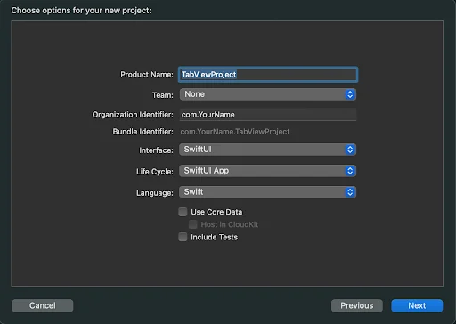
Project Settings
Now select where you would like to save the project. Do not selectCreate Git repository on my mac. Git is a popular tool used for version control. If you do want to use Git for version control, select the option and learn more about Githere.
Once you select a location, click onCreate. Your project should look similar to the image below.
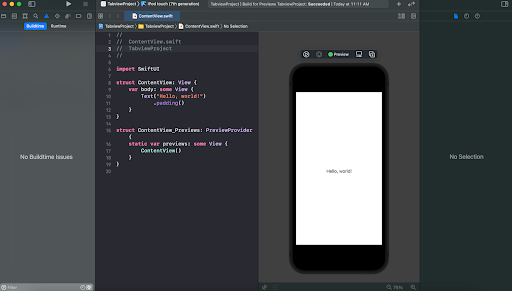
Initial Project
Fantastic, you’re now ready to start building Tab Views and Labels in your project!
What is a tab view?
SwiftUI’s tab view allows for switching between multiple child views using user interface elements such asButton,Toggle, andScrollViewfor example.
Here is a view that contains a Tab View with 2 views.
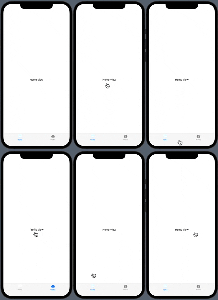
Example Tab View
Why more complex applications benefit from tab views
Tab views allow more complex applications a degree of flexibility that they would not have otherwise. For example, in order to access any other page, such as a user profile, we’d need to go all the way back to the main menu. With the help of a tab view, users can quickly and easily navigate to a profile page by clicking on the icon at the bottom. The video here shows an example of that.
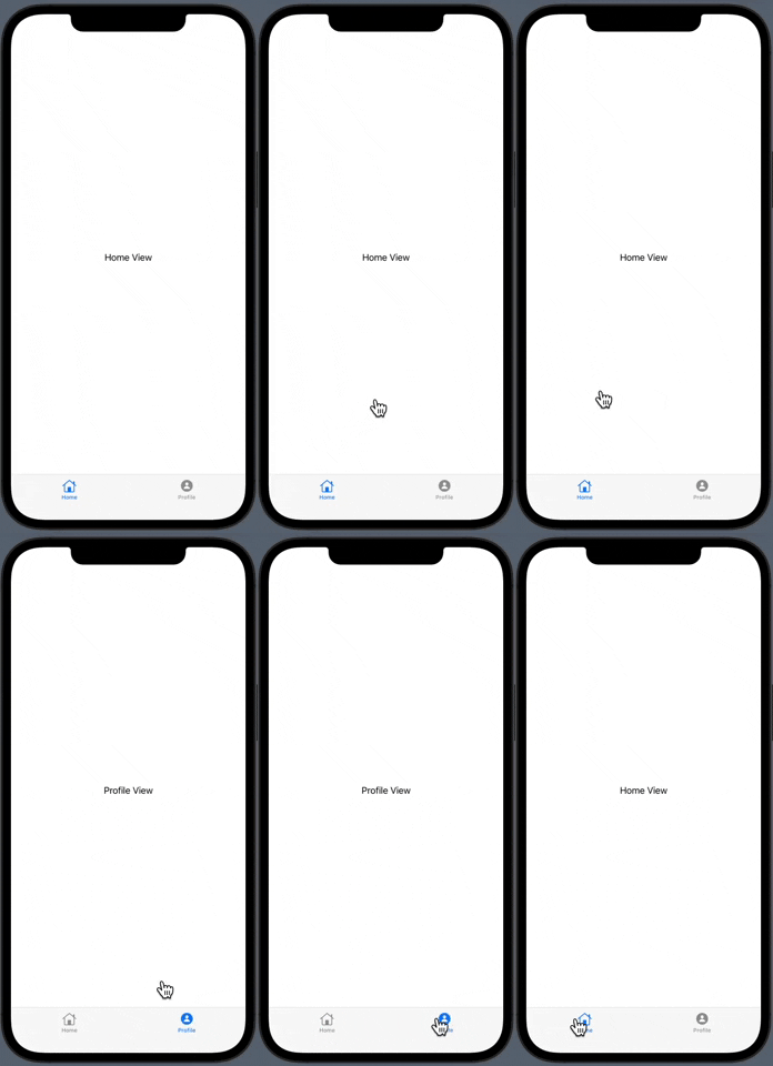
Displaying Switch to Profile View
Tab views can also be used to display items in a page-style manner. In the video below, you can see a page-style tab view scrolling through the views.
Page Style Tab View
As you can see, using tab views creates additional access points to parts of your application without having to use a centralized location such as a main menu.
How to create a tab view
According to the Apple docs, aTabViewwraps views just like aVStackorNavigationView. A tab view is written as:
var body: some View {    TabView {        // Views go here    }}
Copy to clipboard
var body: some View { TabView { // Views go here }}Let’s use the same methodology to create a tab view in the project.
ContentView.swift
import SwiftUI
struct ContentView: View {    var body: some View {        TabView {            // Views go here        }    }}
Copy to clipboard
import SwiftUI
struct ContentView: View { var body: some View { TabView { // Views go here } }}Great work! You created your first tab view. Your view should match the image here.
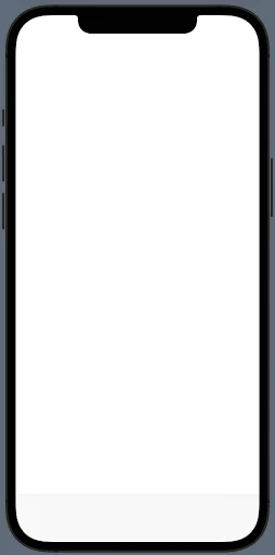
Empty Tab View
The view looks similar, but there is a difference. Did you spot it?
Correct! There is a gray box at the bottom of the screen. This is the new tab view you created!
Let’s add some buttons to the tab view to switch between child views. You can use atabItemto display a button on the toolbar that navigates to a specified view on tap. Let’s take a look attabItem.
What is atabItem?
According to the Apple docs, SwiftUI’stabItemconfigures views as a tab bar item. In this manner, the view will exist within the tab view and is accessible through the tab view bar.
Tab items are usually presented using aLabel. Let’s take a look atLabel.
What is aLabel?
According to the Apple docs, SwiftUI’sLabelrepresents a container for placing an icon and a label on the tab view.Labels are usually attached to a view. In tab views,Labelis attached to a tab item. When theLabelis tapped, the tab item will present the view it is attached to.
Create a tab view using tab items and labels
AtabItemandLabelare written as so:
TabView {    Text("Hello World")    .tabItem {         Label("Label Text", systemImage: "list.dash")    }}
Copy to clipboard
TabView { Text("Hello World") .tabItem { Label("Label Text", systemImage: "list.dash") }}Let’s use the same methodology to create atabItemin the project. Inside thetabItem, place aLabel("Home", systemImage: "house"). Let thetabItembe a modifier for aText("Home View").
import SwiftUI
struct ContentView: View {    var body: some View {        TabView {            Text("Home View")            .tabItem {                Label("Home", systemImage: "house")            }        }    }}
Copy to clipboard
import SwiftUI
struct ContentView: View { var body: some View { TabView { Text("Home View") .tabItem { Label("Home", systemImage: "house") } } }}Fantastic! You added atabItemto your tab view. The tab item contains aLabelthat displays on your tab bar. Your preview should match the one here.
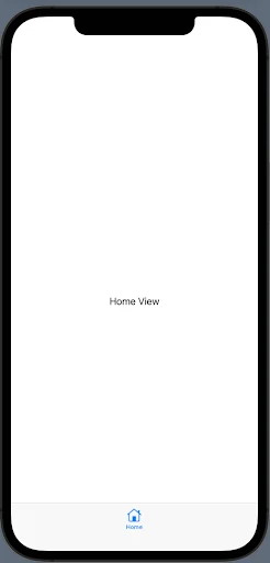
Home View
As noted previously, tab views come in handy when trying to access views quickly. Let’s create a “Profile” page and place it in the tab view.
Much likeText("Home View"), place aText("Profile View")for the profile view. Add atabItemmodifier and include aLabel("Profile", systemImage: "person.circle.fill").
import SwiftUI
struct ContentView: View {    var body: some View {        TabView {            Text("Home View")            .tabItem {                Label("Home", systemImage: "house")            }            Text("Profile View")            .tabItem {                Label("Profile", systemImage: "person.circle.fill")            }        }    }}
Copy to clipboard
import SwiftUI
struct ContentView: View { var body: some View { TabView { Text("Home View") .tabItem { Label("Home", systemImage: "house") } Text("Profile View") .tabItem { Label("Profile", systemImage: "person.circle.fill") } } }}Fantastic! You added 2 views to your application and can navigate to them through the tab view using the tab items. Each tab item contains aLabelto display which view the application will navigate to.
Your preview should match the one here.
Tab View Without Page Style
But, what if you wanted an application to display views similar to that of an e-book? Listing out 100+ pages on a tab bar is unrealistic. Stylizing the tab view with aPageTabViewStyleinstance should do the trick!
How to create a tab view with the page style
Stylizing the tab view with aPageTabViewStylewill remove the tab bar view and display each view as individual pages. These pages can be accessed by scrolling through the views with a swipe gesture.
The following code snippet declares a page-style tab view.
TabView {    // Views go here}.tabViewStyle(PageTabViewStyle())
Copy to clipboard
TabView { // Views go here}.tabViewStyle(PageTabViewStyle())Let’s use the same methodology to create a page-style tab view in the project. After theTabView, add a.tabViewStylethat contains aPageTabViewStyleinstance.
struct ContentView: View {    var body: some View {        TabView {            // Initial View + Profile View        }        .tabViewStyle(PageTabViewStyle())    }}
Copy to clipboard
struct ContentView: View { var body: some View { TabView { // Initial View + Profile View } .tabViewStyle(PageTabViewStyle()) }}Fantastic! You modified the tab view to use the style of thePageTabViewStyle. This removed the bottom tab bar and now you can swipe through the views using a swipe gesture. Your preview should match the one below.
Entire Project Preview
Conclusion & review
Great work! In this article, you’ve covered tab views and labels. You created a miniature project that simulates an application that displays an initial page with access to a profile page via a tab view.
Here’s a recap:
- A tab view allows for switching between multiple child views using user interface elements
- Tab views allow more complex applications a degree of flexibility to access views otherwise not directly accessible at any time
- ATabViewis created using the following code snippet:TabView{// Views go here}Copy to clipboard
- AtabItemconfigures views as a tab bar item
- ALabelrepresents a container for placing an icon and a label
- AtabItemandLabelare created using the following code snippet:TabView{NavigationView{Text("Some View")}.tabItem{Label("View Name",systemImage:"house")}}Copy to clipboard
- A tab view can be stylized using aPageTabViewStyleusing the following code snippet:TabView{// Views go here}.tabViewStyle(PageTabViewStyle())Copy to clipboard
TabView {  // Views go here}
Copy to clipboard
TabView { // Views go here}TabView { NavigationView { Text("Some View") } .tabItem { Label("View Name", systemImage: "house") }}
Copy to clipboardTabView { NavigationView { Text("Some View") } .tabItem { Label("View Name", systemImage: "house") }}TabView { // Views go here}.tabViewStyle(PageTabViewStyle())
Copy to clipboard'The Codecademy Team, composed of experienced educators and tech experts, is dedicated to making tech skills accessible to all. We empower learners worldwide with expert-reviewed content that develops and enhances the technical skills needed to advance and succeed in their careers.'
Complete Payment to Unlock Full Guide & Source Code
You are viewing the 30% preview. Join TopCourseAI Pro to unlock the remaining 70% of this article, unblur all code snippets, and gain full access to all 412 technical projects and guides.
Ready to access the complete step-by-step tutorial?
Gain full unhindered access to all 412 technical projects and guides, unblur all source code snippets, and download runnable scripts.
Related Project Guides
View all 412 →Best IDEs for Mobile App Development: A Complete Guide
AnIDE(Integrated Development Environment) combines essential development tools into a single application, making mobile app development more efficient and organized. Rather than juggling separate tools for coding, debugg...
Mobile developmentBuilding Lists in SwiftUI
Presenting textual and graphical information in a column is a very familiar and natural way to visually organize data. Almost all modern apps utilize some sort of columnar data display. Think of popular social media apps...
Mobile developmentGrids in SwiftUI
The grid layout has become a familiar paradigm for mobile user experiences. The canonical example of grid layout is in the built-in camera roll app for iOS. It can also be found on an extremely popular social photo-shari...
Ready to start building your next project?
Enjoyed this guide? Continue exploring our library of 412+ step-by-step guides, starter files, and practical projects across Web Development, Mobile Apps, AI, and Design.